Facebook Page Update

My Anti-Fracking Campaign Facebook Page now has 27 likes and thank you to all the likers, because of them I can shorten the URL.  This proved quiet problematic as  just like when choosing a name for the page all the good names are taken and I couldn’t even have the URL ending with Fracking NO, so the closest name to this was Frack NO. This means my Facebook Page for the Campaign can now be found at www.facebook.com/FrackNO. This Is a lot shorter and hopefully more memorable than the address that Facebook automatically gives you when you sign up for a page.

This now means that I can add this shorter URL to any litrature that is needed for the campaign, with the first thing being the poster so these can be completed and printed.

Kinetic Typography Research

As I’ve to create Kinetic Typography for this project I have been doing a little research. Kinetic Typography is something that I have never done before and I have never used After Effects so this will be a big learning curve for me, but I’m looking forward to it.

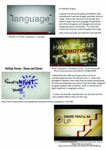
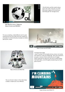
kinetic typography-videos kinetic typography-videos2

Here are a few of the videos that I’ve been looking at.

We Must – Kinetic Typography (Carbon Cap Contest) from AaronJPatterson on Vimeo.

New York Times: Turkish Edition from Quba Michalski on Vimeo.

H.E.L.P Kinetic Typography from Rick Joaquim on Vimeo.

I need to start planning what it is I want to say, the facts that I want to put across! Will I have any simple images within my Kinetic Typography? What colours will I use? It needs to look like it comes from the same campaign as my poster and Facebook Page! What fonts will I use?

Further development

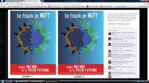
Yesterday I posted the 2 final poster design ideas on our class Facebook Page asking my fellow students for their feedback

fb screen grab

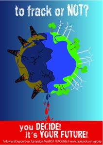
Some prefered the simple crack in the Earth while the majority prefered the screaning face . As the majority are also within the age group of my target audience I have decided to continue to develop the Earth with the face in it a little further. I feel that this face is too rounded and it should maybe more straight lines and jaggy like a crack. This is what I have come up with so far.

poster7

and once again for some reason the colours have all gone bright, even though I always work in CMYK….. why does this happen?

**update**

face poster2

ah ha! seems I’ve sussed out my colour problem, I much prefer  the duller colours, the bright green on the other poster makes it look far too cartoony! arrrgh just when I thought all was well with my colours, I’ve just seen this post when it’s published and the colours are bright again!!!! WordPress what are you doing to my images?

Now I’m thinking do I lose the exclamation mark after DECIDE? …..  I think yes, as that group of text works as one sentance.

Development

Once the research was complete I thought of 4 concepts that I could use

  • Metaphor
  • Shock
  • Typography
  • Green/Enviromental

To get some of my ideas down on paper I created rough sketch thumbnails and then started to develop these ideas.  At the early stages of development these are quite basic and need further work, but every design has to start somewhere.

Metaphor

This slideshow requires JavaScript.

I felt that Metaphor was the weakest of my concepts and so this one was dropped from further development.

Shock

This slideshow requires JavaScript.

I liked the baby in the water drop and did consider developing this further, but felt that this maybe would not capture the market audience for this campaign.  I liked the use of simple shapes and flat colour and this is a style I may find a use for in another project. In the future I might if time allows develop this poster further, just as an exercise for myself.

Typography

This slideshow requires JavaScript.

I felt this was quite a strong concept and would grab the market audiences attention, the background consists of words that are the consiquences of Fracking. I struggled trying to decide if I should continue to develop this concept or not, but after further develpment of the next concept I decided to stop developing the Typography concept as I would concentrate on typography for my Kinetic Typography video.

Green/Enviromental

This slideshow requires JavaScript.

This was the concept I felt would appeal more to the target audience. I’m not telling them what they should do, I’m showing them and letting them decide their future. Hopefully this will make veiwers of the poster think about what Frackig is and what it’s doing to the world and everything and everyone that lives on it. Fracking is killing Earth and there is only one Earth, it’s our home, without it where would we be?

Even though I have developed this design using CMYK for some reason, which I will no have to look into, the colours are different on a few of the images! The images should all be the duller colours and not the bright ones.

This concept is still open to maybe further development, especially the Facebook Cover and Profile images. I aslo still need to think of a name for the Facebook page, all the good Anti-Fracking names seem to have been used by other campaigns.

I now have to think about how I’m going to create my Kinetic Typography video, this is going to take some time as I’ve never used After Effects before, so a steep learning curve once again and a deadline that is getting closer!

Research

I’ve been so busy working on my projects i had forgot about updating this blog, so here goes starting with some research.

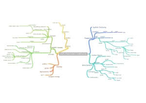
Like all my projects this begins with a mind map

mindmap

Then some research on existing Anit-Fracking Campaigns and Guerilla Campaigns

This slideshow requires JavaScript.

Next I needed to do some research on Fracking as I had heard about this but knew nothing about it, just like my target audience I suppose. This is when I started to realize the effects that fracking has on our enviroment and health. The facts are just shocking and I can see now why so many people worldwide are against fracking. This is just a small part of my research.

This slideshow requires JavaScript.

Then I looked at some designers whose work I liked to get some inspiration for my poster design.

This slideshow requires JavaScript.

Anti Fracking Campaign

This blog is set up to post  my work for a Creative Project  for college. It will be used as a way of my tutors seeing my work and as a back up for some of my files as I work through the project.

The project is to create a viral campaign against the practice of Fracking, something that at this moment in time I do not know much about, but will learn more as I go through the process of researching this subject and developing my campaign.

Brief Evaluation

Schedule

What is Fracking? Lets start the research……..

Fracking Explained: Opportunity or Danger

I feel that the target audience are more likely to watch and stay interested in this video above than the one below, even though the one below is very interesting and full of facts.

Dr Mariann Lloyd-Smith speaking about toxic risks of CSG at Lismore, NSW, 1 March March 2012